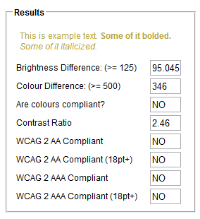
The font color of hyperlinks, especially unvisited hyperlinks, on UX meta (yellow on a white background) is very hard to read. Maybe we could add more contrast?
-
You're referring to the unvisited link color I assume?– Zelda ModCommented Apr 9, 2012 at 20:25
-
Yes, the titles of the questions before you opened them. :visited links are easier to see, but still rather light.– NickCommented Apr 9, 2012 at 20:27
-
Agreed, the unvisited link text is a bit bright on white.– Zelda ModCommented Apr 9, 2012 at 20:28
-
I've updated the question to refer to hyperlinks in specific.– NickCommented Apr 9, 2012 at 20:34
-
Basically, SE should steer clear of yellow.– fredleyCommented Apr 10, 2012 at 14:23
-
@fredley poor yellow, gets no respect. A highly problematic and polarizing color however.– Zelda ModCommented Apr 10, 2012 at 18:19
Add a comment
|
1 Answer
Note: The colour currently used violates WCAG compliance for readability.

Note also: The :visited colour is just about compliant, but still not ideal.
-
I'm not colorblind, but I have an exceedingly difficult time telling what each color MEANS. The darker, more readable color is the color of a link that I've already visited, while the paler, more squint-inducing color is one that I have yet to go to. It confuses me every single time I look at the "Related" list in Meta.– KarenCommented Apr 10, 2012 at 19:37
