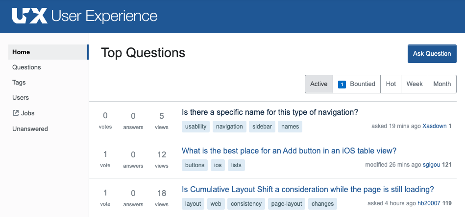
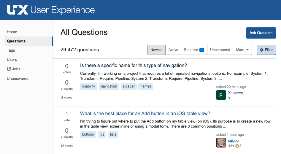
Does UX StackExchange really need both "Home" and "Questions" tabs in its left nav? "Home" seems to be the Questions page with the "Hot" filter applied; it's pretty easy to see all active questions without a Questions tab. Doesn't this violate the principle of Don't Repeat Yourself? And isn't showing filters in two places confusing?
-
1Although I would say "Home" is more about what they want you to see, and "Questions" is more about what you want to see.– musefanCommented Aug 27, 2020 at 15:14
-
Does this answer your question? The multiple question lists on Stack Exchange sites - a working concept?– maxathousandCommented Aug 31, 2020 at 15:33
-
WIP for more than seven years... guessing it's not a priority, then. Thanks.– IzquierdoCommented Aug 31, 2020 at 15:36
-
@StacyH Yeah, people have been aware of this awkwardness for even longer than that.– maxathousandCommented Sep 1, 2020 at 19:55
1 Answer
The “home” page is different from the “questions” page: the home page list will filter out any questions that score less than -3 (or -8 on meta) while the questions page does not. So, even though there are several tabs that have the same name on both pages (bountied, active), they have slightly different questions.
Should it be like this? In my opinion absolutely not! There’s no indication that filtering is happening; the only place this is documented is somewhere obscure on a meta site. There’s also more than enough evidence that this confuses even the most involved users, including moderators and users with 100k+ rep. Because people are confused, they are likely to miss out on important things, namely updates on heavily downvoted meta posts.
I would like to see custom filters replace “home”, with a little power boost by allowing you to filter out questions with a low score, as some people like that functionality.


